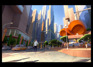
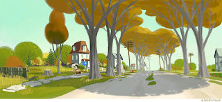
these thumbnails are to get an idea of what should/shouldn't be in the scene for this short. Are these too complicated? Do we need to simplify. I like C and A a lot. Wesley's thumbnails for this scene are fantastic too. We just need to know if we need to design lampposts or trees or anything else random that should be in the scene.
Here are some color examples I'm leaning toward
i have pigeon ref I could post too, but I think I'm going to hold off on that one


C and A are my favorites too. Between the two, I like C.
ReplyDeletealright cool. Megamind is perfect reference. :) I like C also.
ReplyDelete